
Color can transform a space, impacting our emotions and perceptions in surprising ways.
However, there are many myths surrounding color psychology that can lead to misconceptions in home decor.
In this article, we’ll bust 10 common color psychology myths, revealing what really influences the mood of your home.
Get ready to rethink your color choices and learn how to create a home that truly reflects your desired atmosphere!
Myth #1: Red Always Means Danger or Anger
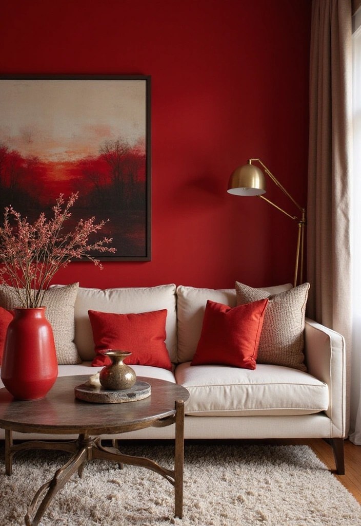
The color red often gets a bad rap as a symbol of danger or anger.
In reality, red is a dynamic and empowering color that can also evoke feelings of passion, warmth, and excitement. When used in home decor, red can bring energy to a space, making it ideal for areas where social interactions take place, like living rooms or dining areas.
– Consider using red as an accent color through accessories such as cushions or art.
– Pair it with softer shades to balance its intensity.
– Be mindful of the specific shade of red you choose; deeper, richer reds can create a feeling of comfort, while bright reds can feel stimulating.
In this way, red can be your ally in creating a vibrant and engaging atmosphere rather than just a warning sign.
Product Recommendations:
Myth #2: Blue is Always Calming

While blue is often associated with tranquility, it’s not universally calming.
Depending on the shade, blue can also evoke feelings of sadness or coldness. Lighter blues are typically more soothing, while darker blues can feel heavy and serious.
– Use soft, light blues in bedrooms or bathrooms for a serene feel.
– Consider warmer shades of blue, like teal, which can add vibrancy without losing the calming effect.
– Balance blue with warm colors like yellows or creams to create a more inviting atmosphere.
By understanding the nuances of blue, you can effectively use it to enhance your space’s mood without falling into the misconception of its calming nature.
Product Recommendations:
Myth #3: Green is Always Refreshing
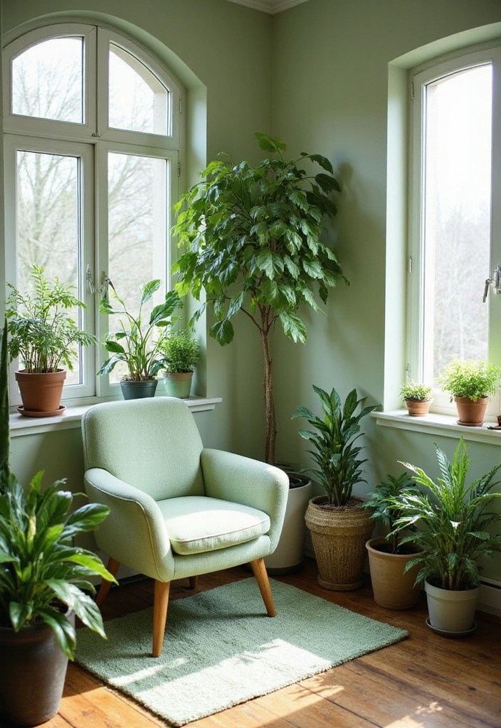
Green is often celebrated for its refreshing and natural qualities.
However, not all greens create a rejuvenating experience. Darker greens can sometimes feel oppressive or overly serious, while bright greens can be overwhelming and harsh.
– Use light, soft greens in spaces meant for relaxation, like bedrooms or quiet nooks.
– Consider rich, earthy greens for dining areas to create a cozy, grounded feeling.
– Pair greens with natural elements like wood to enhance their organic vibe.
Understanding the shades of green will help you cultivate the desired mood in your home while avoiding the one-size-fits-all misconception.
Product Recommendations:
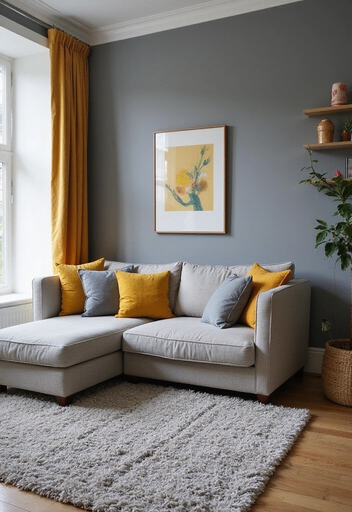
Myth #4: Yellow is Always Cheerful
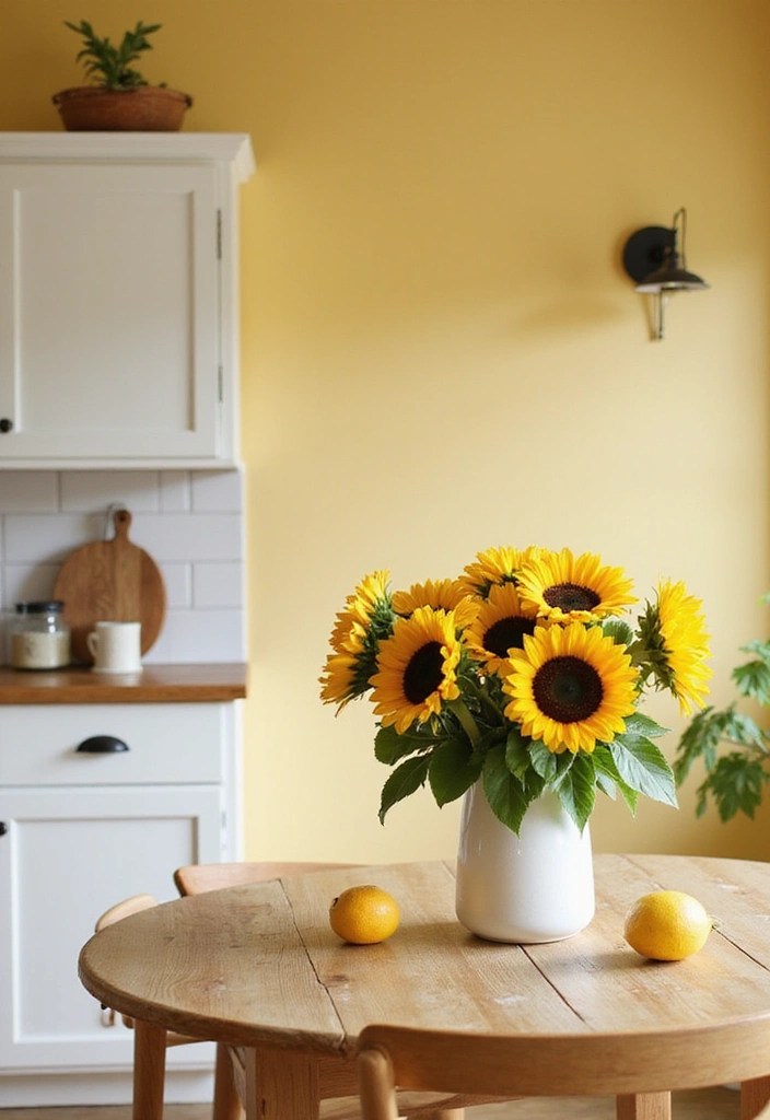
Yellow is often linked to happiness and sunshine.
However, bright yellows can be overwhelming and even irritating in large doses. Instead of an uplifting vibe, too much yellow can lead to anxiety or restlessness.
– Use softer, muted yellows to create warmth without overwhelming the senses.
– Incorporate yellow as an accent rather than a dominant color in a room.
– Balance yellow with complementary colors like gray or blue to soften its impact.
By understanding the spectrum of yellow, you can harness its positive energy while avoiding the potential pitfalls of too much brightness.
Product Recommendations:
• Decorative yellow throw pillows
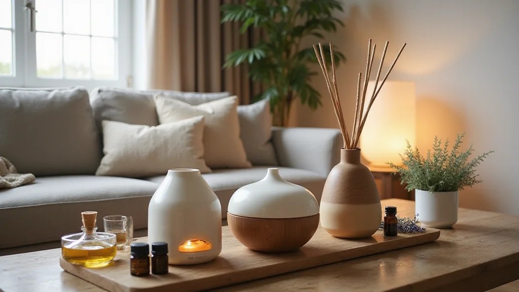
Myth #5: Neutrals are Boring

Neutrals are often dismissed as bland or boring.
In reality, neutrals provide a sophisticated backdrop that can enhance the beauty of other colors in your decor. They add depth and warmth to a space while allowing vibrant colors to shine.
– Use various shades of neutrals to create texture and interest in a room.
– Layer neutral colors with different materials like fabrics and woods for a rich look.
– Incorporate pops of color through accessories or artwork for a balanced aesthetic.
By embracing neutrals, you can create a timeless and elegant environment that remains visually appealing.
Product Recommendations:
• Beige textured throw pillows
• decorative blue and green wall art
Myth #6: Black is Always Dark and Gloomy
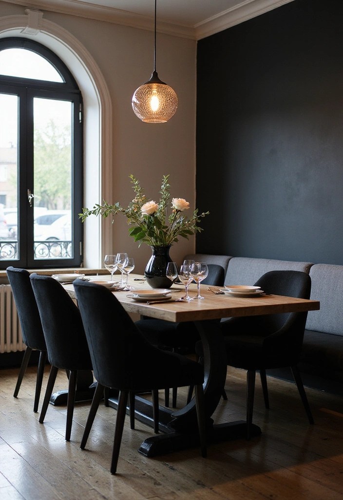
Black is often viewed as a color of mourning or darkness.
However, when used thoughtfully, black can add elegance and sophistication to any space. It can create contrast and depth, making other colors pop.
– Use black as an accent to define spaces and create a modern look.
– Combine black with light colors to maintain a balanced atmosphere.
– Use different textures to soften the impact of black, making it feel inviting rather than oppressive.
When used wisely, black can be a powerful asset in your decor arsenal, shifting the perception from gloom to glam.
Product Recommendations:
• Modern black table centerpiece
Myth #7: Pink is Only for Girls
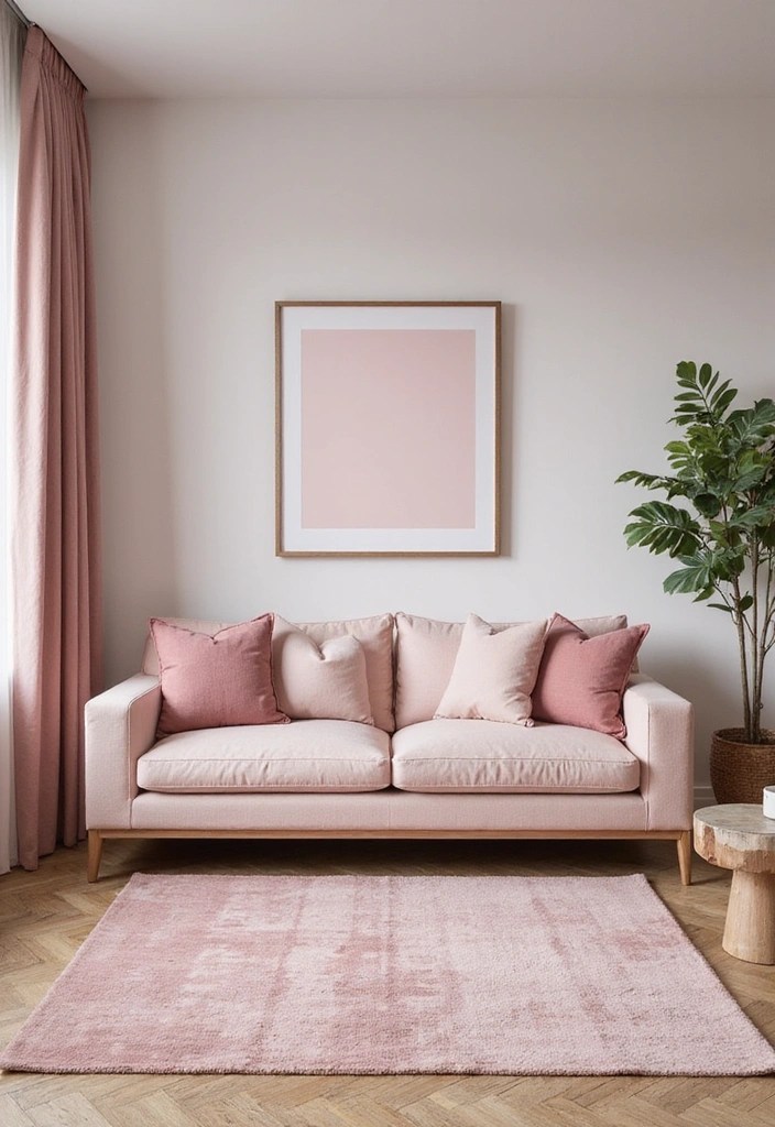
Pink is often stereotyped as a color for girls or children.
However, pink comes in many shades and can evoke a range of feelings, from playful to sophisticated. It can create warmth and approachability in any space.
– Use soft pinks in bedrooms or nurseries for a calming effect.
– Explore deeper, muted pinks for a more mature and elegant look in living spaces.
– Combine pink with neutral tones for a chic, modern aesthetic.
By embracing pink as a versatile color, you can create a welcoming environment that defies outdated stereotypes.
Product Recommendations:
• Soft pink decorative pillows
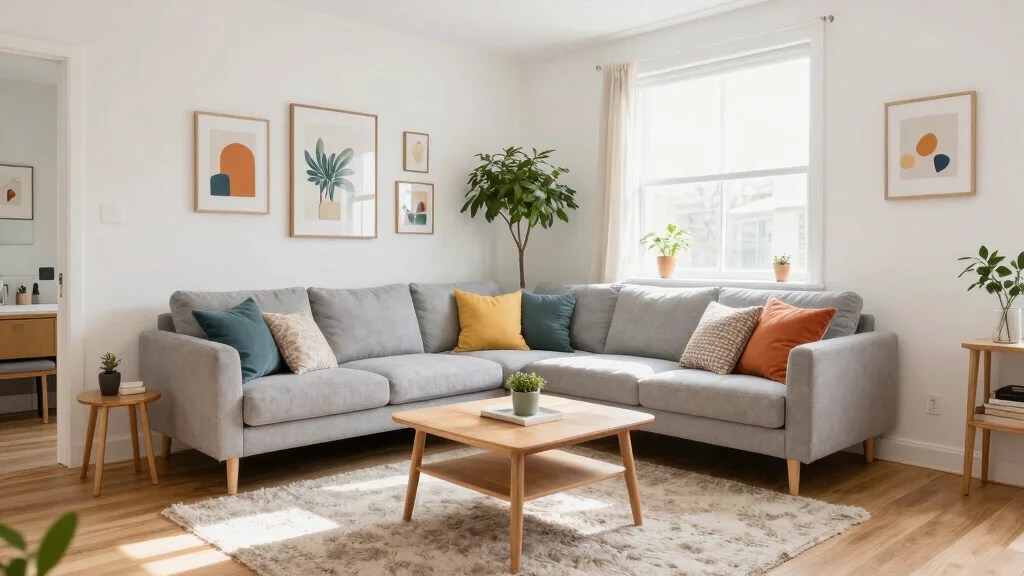
Myth #8: Gray is Just Dull
Gray often gets a reputation for being dull or lifeless.
However, gray can be one of the most versatile colors, providing a calming and sophisticated backdrop. It can add depth and warmth when paired with the right colors.
– Use warmer shades of gray to create a cozy atmosphere in living areas.
– Incorporate different textures like fabrics and metals for added interest.
– Pair gray with vibrant colors like yellow or teal to create a striking contrast.
By understanding the potential of gray, you can craft a space that feels both modern and inviting.
Product Recommendations:
Myth #9: Color Has the Same Effect on Everyone
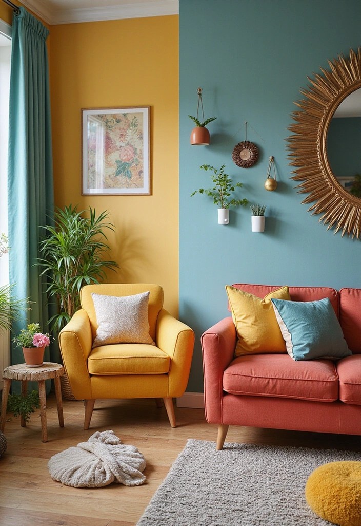
It’s a common belief that color affects everyone in the same way.
In truth, individual experiences, cultural backgrounds, and personal preferences shape how we perceive color.
– Consider the context of your home and how individuals will interact with colors.
– Use colors that resonate personally with you and your family for a more meaningful impact.
– Be mindful of cultural associations with colors, as they can vary widely.
Understanding this diversity will help you create a space that feels uniquely yours, reflecting your personality and experiences.
Product Recommendations:
• Mood-Enhancing LED Light Strips
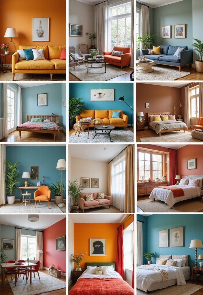
Myth #10: Color Choices Don’t Matter

Many believe that color choices are merely aesthetic and don’t impact mood or behavior.
In reality, colors can significantly influence emotions, perceptions, and even productivity levels.
– Choose colors according to the functions of each room.
– Use colors to set the tone for specific activities, like calming blues for relaxation or energizing yellows for creativity.
– Consider the natural light in your space, as it can alter how colors are perceived.
Recognizing the power of color in your home can lead to more intentional and meaningful design choices.
Product Recommendations:
• LED color-changing light bulbs
Conclusion
Understanding color psychology is essential for creating spaces that resonate with your mood and style.
By busting these myths, you are now equipped to make more informed choices that enhance your home’s ambiance.
Remember, color is a powerful tool that can transform your living environment and elevate your overall well-being!


Leave a comment